Not so long ago websites were not performing as good as nowadays, they were heavy and slow, taking ages to load as well as lacking good user experience. Fortunately, with responsive design, these days are way behind now and the majority of the websites are well built, factoring in best website development practices. Therefore we are able to use smartphones so smoothly and perform quite complex tasks.
Lets have a look at some numbers:
- 2018 – 52.2% of the global online traffic was generated via smartphones; this is 1.9% more than in 2017
- 70% of smartphone owners, before making any purchase in a store, first check the product information on the internet.
- 89% of users are more likely to recommend the brand to their friends if the online mobile experience was positive
- More than 40% of online transactions are made via smartphones and other mobile devices
- 80% of B2B company owners are looking for industry related information on their tablets
As mentioned before, today’s website that performs equally good on a desktop computer and on a smartphone is not a privilege but quite a common phenomenon. This is achieved with the help of the web technologies and responsive design layout of the website.
So, what is a responsive layout?
Responsive layout – is an intelligent website layout, that changes according to a situation. This could depend on screen size, user actions, platform and device.
At the design stage when the responsive design is being implemented, there are mistakes that are often ignored and done even by experienced professionals. Let’s cover the five most popular responsive design mistakes and prevent them from happening.
01. Reducing content
Normally you expect to get full information on interested and if the user is forced to go and visit the full version of the site on a desktop computer, means that there is no point in mobile version at all. User cannot be expected to remember to go and check desktop version for full information later on a user needs this info now and here. Whole reasoning for the missing information because it does not fit on the smartphone display is similar to a photo of a person that was taken without hand, simply because it does not fit in the camera lens.
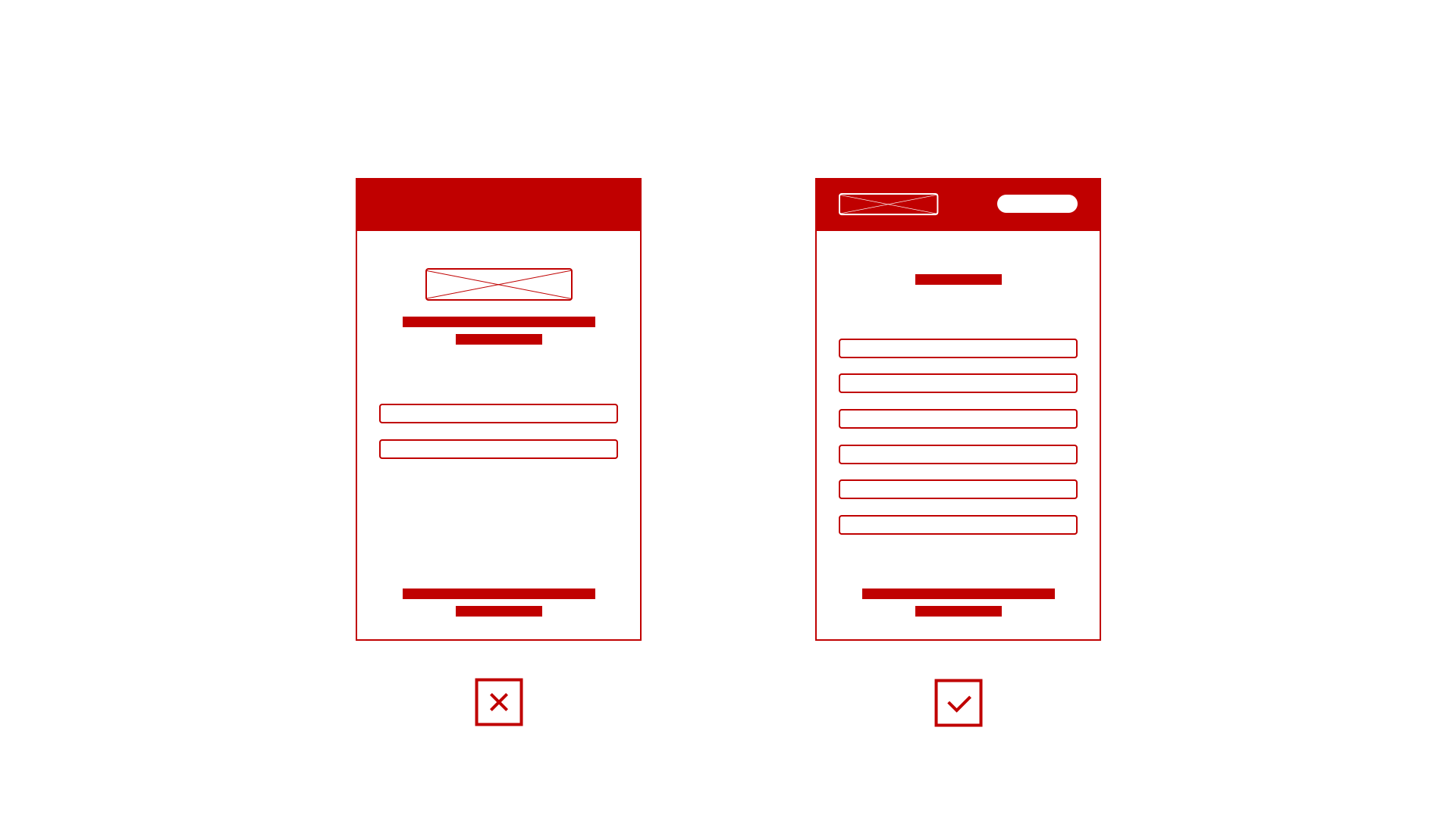
This leads to bad user experience and if we are not talking about some very complex solutions that only could be fully performed only on larger screens we should, by all means, feature full info on a mobile version as well.
Mobile user should not question the version in view: “Am I getting full information?”.
02. Use of heavy images
As mentioned above switching to the desktop version of the site is not relevant, we not always can boast of fast mobile connection. Therefore if the website is filled with unnecessary large pictures, it will reflect on slow load speed. This could be solved with the optimised weight of pictures or with a set of mobile-specific pictures.
According to the study results conducted by Strangeloop, if the site on a mobile device is taking longer than 3 seconds to load, 57% of users will leave it.
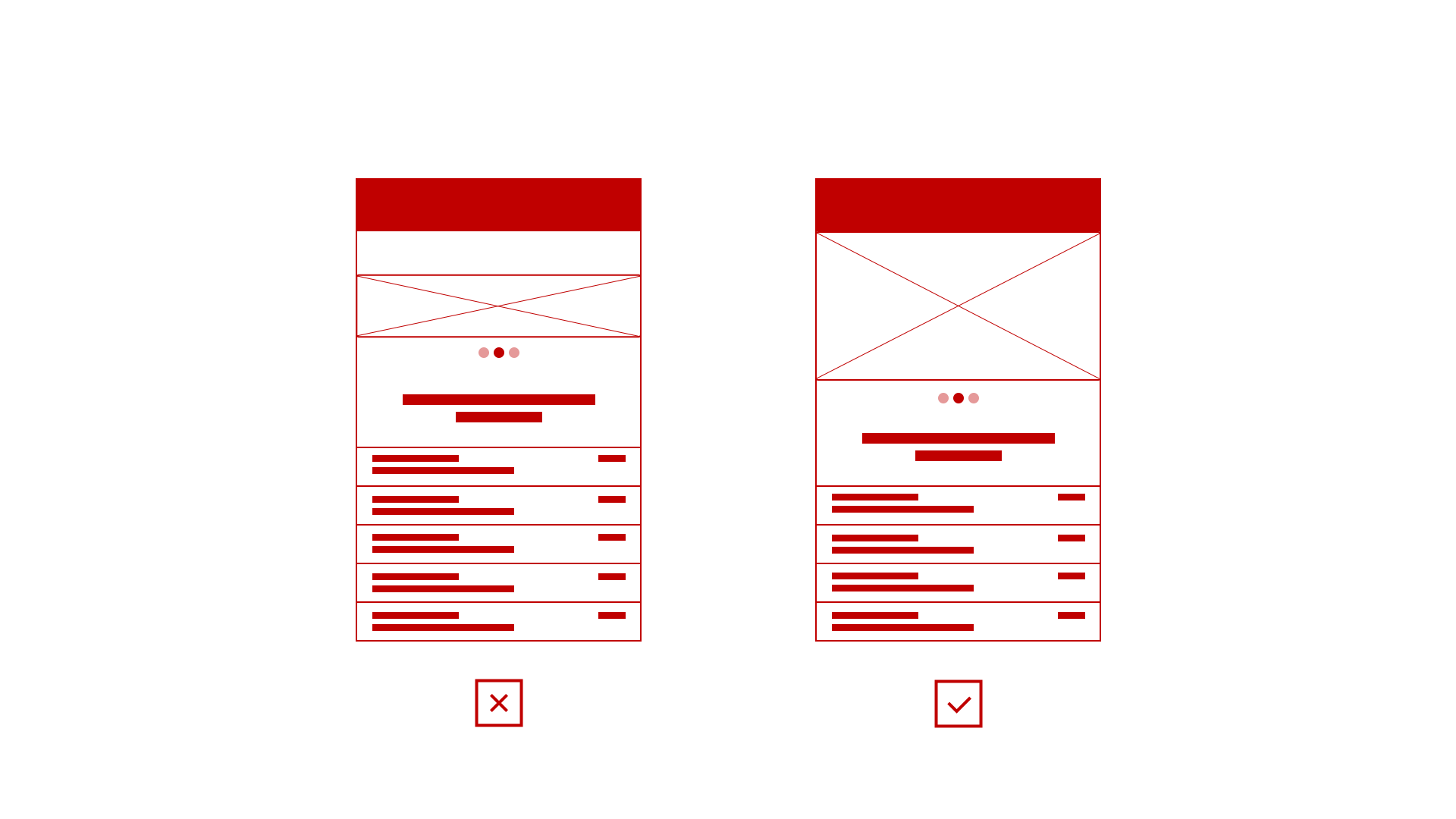
03. Small sized UI
Users shouldn’t be going through painful experiences where they are unable to use an adaptive version without zooming in. Not many users will tolerate this experience, it is tiring for eyes as well as many UI elements are too small either for a tap or to be seen without a thorough look.
The responsive interface design should be developed in a way that allows a user to immediately detect key navigation elements and provide ease of use when taping on clickable UI elements without any zooming in.
UI interface in the responsive layout should be a decent size, providing the best possible UX.
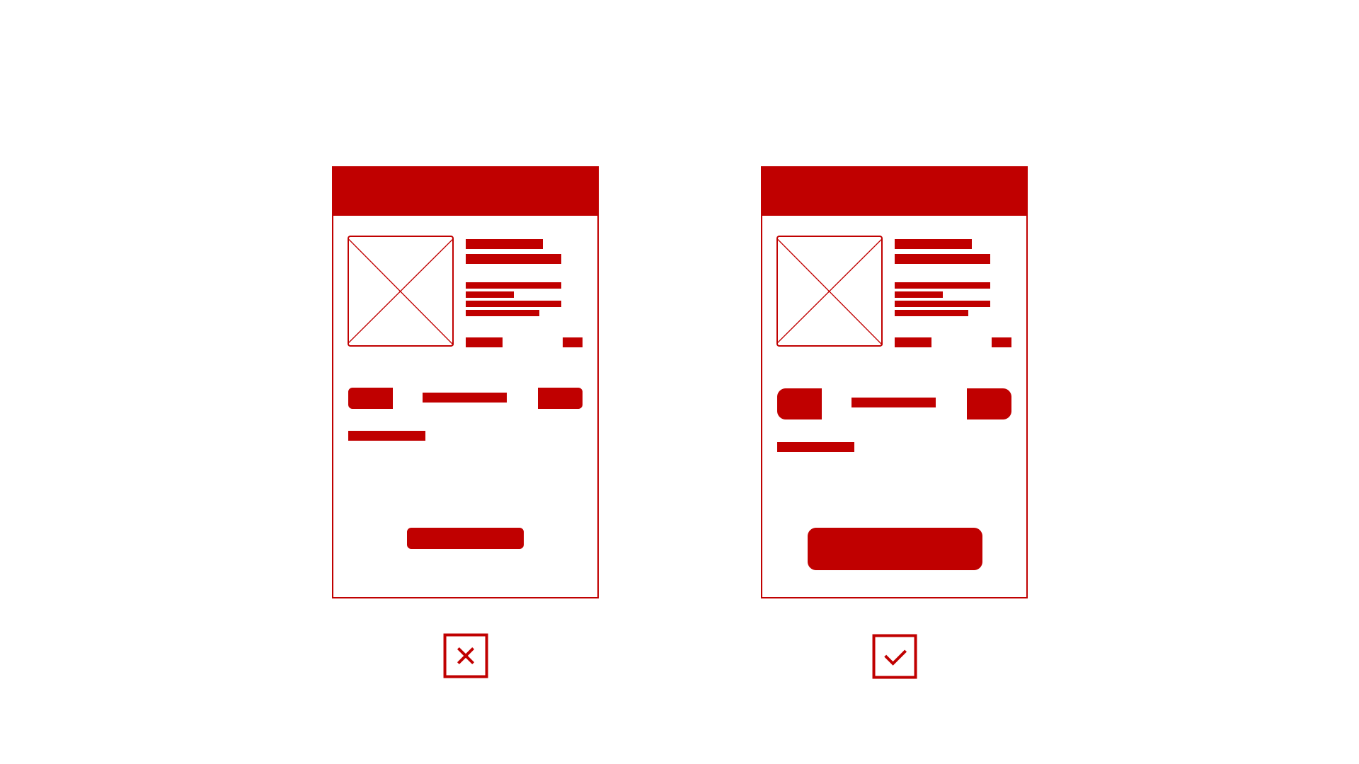
04. Usability specifics
It’s important to consider how this adaptive design will be used by users, in what scenarios and if there are any device specifics that should be counted in. This depends on device resolution, internet connection, text entry method and so on.
A great example would be the use of a smartphone on a go, this is a common phenomenon these days. Therefore, it’s crucial to have decent fonts size, having all of the key navigation UI within the reach of a thumb. In addition, do not forget that hover statuses do work on mobile devices as there is no hover action, only tap, slide, drag and hold actions.
Another example, we use tablets after work and hold them in landscape or portrait orientation depending on the scenario and what is more convenient at the time. This means that responsive layout should be developed for both orientations.
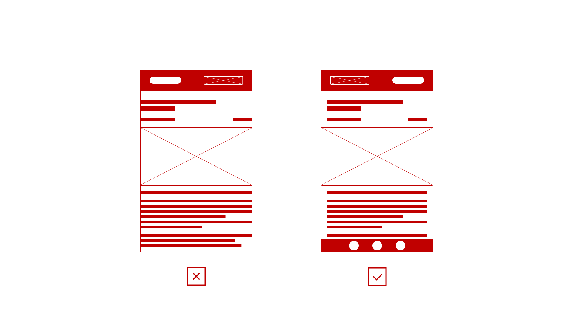
05. Mobile first approach
“Mobile first” design is one of the most popular approaches to design and develop websites. It also means that the established tradition to design desktop version first, without much consideration of what will be happening on mobile devices and working on a fix for mobile is way in the past.
This is an intelligent as well as a flexible design approach allowing to minimise possible issues in the later design stages. Unfortunately, many people misinterpret “Mobile first” meaning. To begin with, it does not mean that design development starts with mobile views. Instead, you start structuring desktop version of the website with consideration of mobile version in mind, carefully making your decisions. These decisions will save a lot of development as well as a result you will end up having a consistent user experience.
Choosing “Mobile first” approach, not only saves time as a result but also helps you to identify possible issues.
Do not forget that probably half of the traffic will come from mobile devices, this means that you must equally look at the responsive design and spend as much time working on it. If you are interested in the website build processes, you may find this article useful “What will be the right process for a website build?“
Leave a Reply